insider's portal
An intuitive patient portal to centralize crucial post-operative information.
CONTEXT OF THE PROJECT
overview
THE PROBLEM
The clinic lacks a centralized system leading to patients struggling to find clear, accessible information about their surgical recovery.
Clinic staff are only available during regular operating times
Patients receive inconsistent instructions and support
No direct channel for post-op questions or follow-up
THE OPPORTUNITY
To develop a user-friendly, secure patient portal that empowers patients to manage their recovery confidently and reduce staff workload.
Standardize communication to ensure consistency
Add a secure contact form for follow-up questions
MY CONTRIBUTIONS
Content Strategy & Information Architecture: Led the content strategy and structure of the portal to ensure clarity, accessibility, and alignment with patient recovery timelines, prioritizing user confidence during post-operative care.
Layout & User Flow: Designed the homepage layout, navigation structure, and button interactions to guide patients through a seamless experience, from initial login to finding post-op instructions.
FAQ System: Developed a categorized FAQ section by sourcing common patient questions from clinic staff, organizing answers into intuitive groupings for faster access and reduced support requests.
Wireframes & Prototypes: Created desktop wireframes and high-fidelity prototypes in Figma to test content hierarchy, layout clarity, and ease of use.
Cross-Team Collaboration: Partnered closely with clinical staff to ensure all medical content was accurate, consistent in tone, and appropriate for a wide range of patient reading levels.
Microcopy & Messaging: Wrote empathetic, action-oriented copy for buttons, headers, and system alerts that reflected the clinic’s calming tone while guiding users with reassurance and clarity.
DESIGNING THE PRODUCT
When designing the Insiders Portal, I collaborated closely with stakeholders to turn clinical feedback into a patient-centred experience. This meant prioritizing clarity, accessibility, and emotional reassurance to support users during a stressful recovery period.
By refining content and streamlining the interface, we aimed to reduce confusion, ease staff workload, and build patient confidence through thoughtful design.
KEY FEATURES

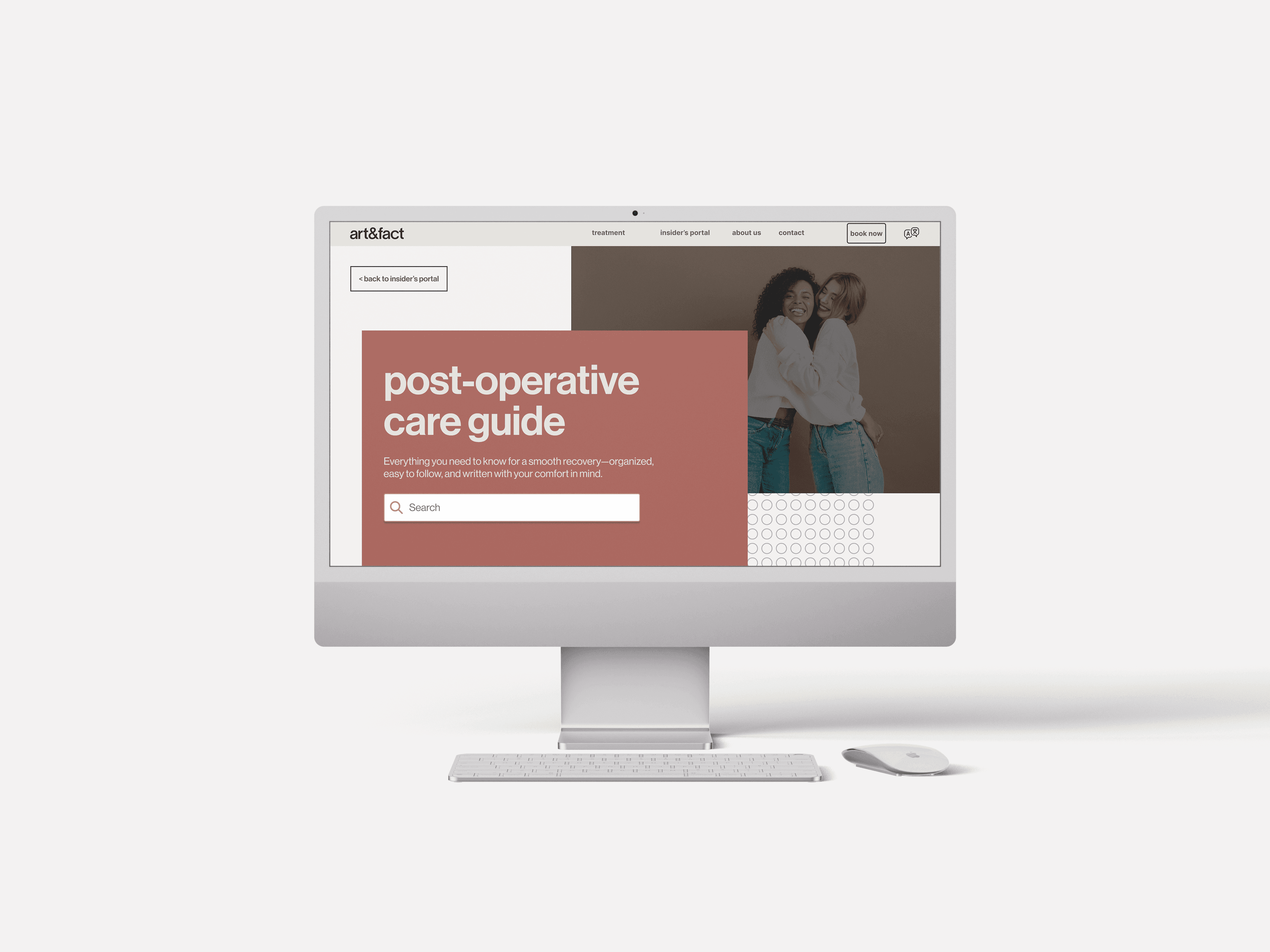
Centralized Information Hub
The portal consolidates all recovery instructions into one easy-to-access location, helping patients avoid confusion caused by scattered documents or verbal directions.
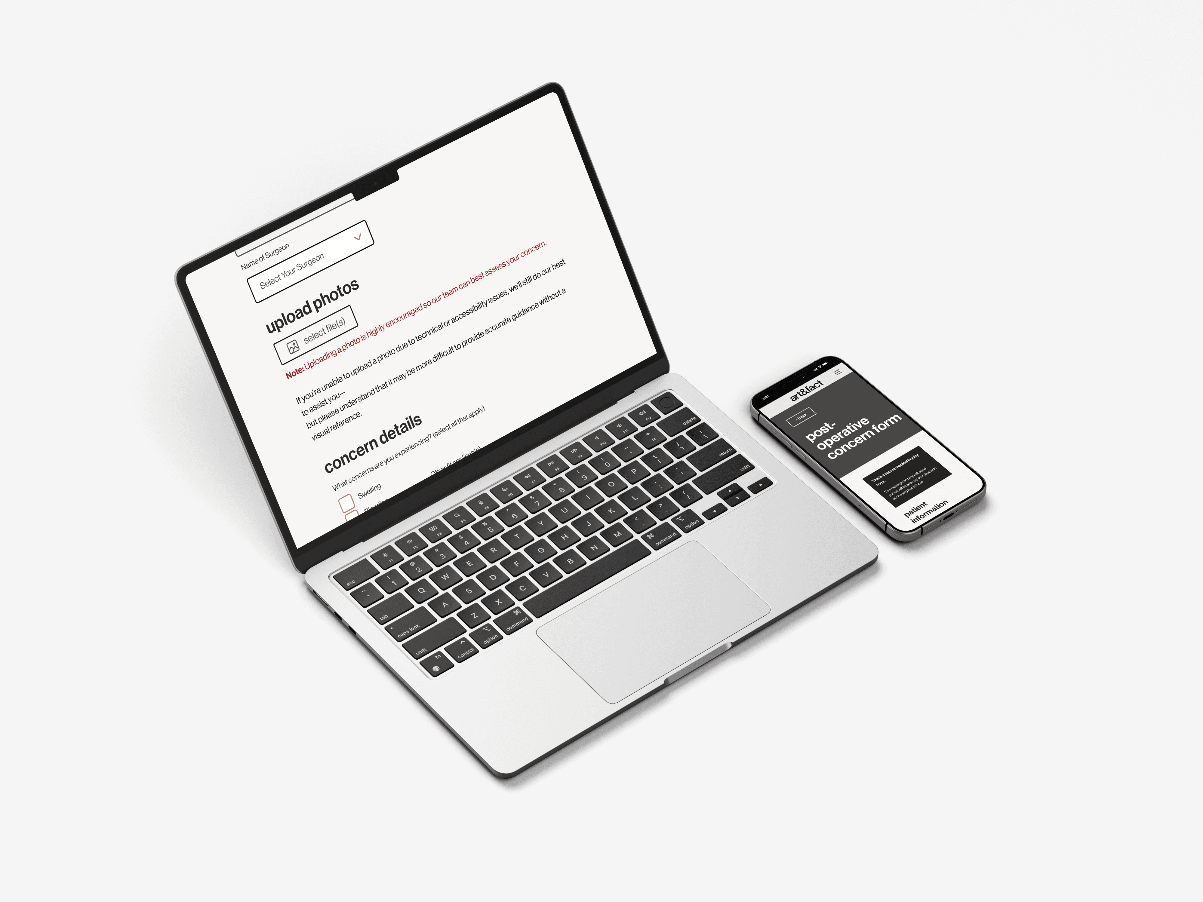
Secure Contact Form
A built-in form allows patients to safely submit post-operative concerns directly to clinic staff to streamline timely, private communication without relying on phone calls.

Self-Serve FAQ Section
An interactive FAQ section addresses frequently asked questions in a clear, organized format to reducw repetitive inquiries and empowering patients to find answers independently.
IMPACT
Improved Patient Understanding
Reduced Administrative Burden
Streamlined Patient Experience
2 | reflection
MY TAKEAWAYS
Working on the Insiders Portal was a deeply rewarding experience and a meaningful opportunity to apply my UX and content strategy skills in a real healthcare context.
The project brought a mix of complexity and creativity—balancing clinical accuracy with user empathy pushed me to think more critically about accessibility, clarity, and emotional tone. I appreciated the close collaboration with stakeholders, which shaped the final design into something both practical and people-focused.
WHAT WORKED WELL
Microinteractions Matter
Small details like button states, helper text, loading messages, and form spacing significantly shaped the user experience.
Accessibility is Essential, Not Optional
Prioritizing contrast, mobile layouts, and alternative input methods helped reduce friction for a diverse patient audience.
Design is Collaborative
WHAT I'D DO DIFFERENTLY
Integrate Visuals
Including diagrams or visual aids in early drafts may have improved clarity for patients with lower health literacy.
Anticipate Edge Cases
Some issues (like form submission anxiety or image upload challenges) could have been addressed earlier with stronger UX planning.
Testing with Real Patients
Testing with actual users early in the process could have revealed emotional and accessibility needs sooner.
CONTINUING THE PROJECT
art&fact have expressed interest to continue the project and furthering the current scope to maximize the usability and accessibility of the Insider's Portal. Stay tuned for more exciting developments!